Project Reveal: Transformative Bathroom Remodel in South Livermore
Everyone who knows me knows how much I love my clients. The owners of this home are no exception. And when you add their adorable dog, Maddie, they quickly rose to epic-level clients!
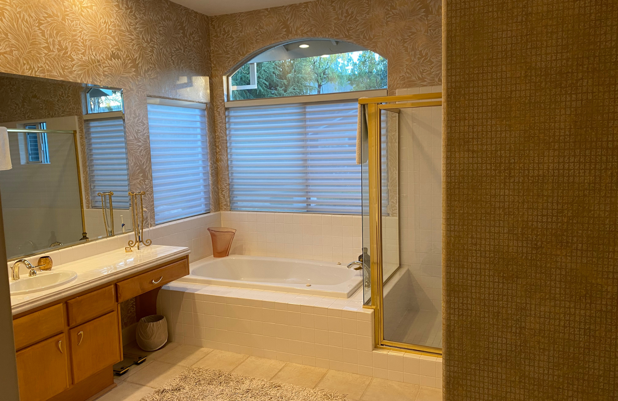
The clients wanted to update their Primary Bath by opening up the space, modernizing the feel, and creating a better flow for the task areas.
In addition, we needed to add a dressing area, find a convenient location to mount a TV, increase the shower space, and find a solution for the toilet area that had been inconveniently located in the very center of the room.
A tall order indeed, but we solved all of these requests with some hard work and the clever use of rearranging the space. (see also #totalgut #downtothestuds #letsstartover)!
Challenges & Solutions
Our biggest challenge had to do with the existing layout of the space. Our solution was to relocate the toilet area from its current location in the very center of the room to the more appropriate, out-of-the-way spot where the shower had been located.
By switching these two areas, we were able to provide additional ventilation for the toilet area by placing it next to a window, remove the focal point in the space AWAY from the toilet, and provide a much needed larger shower.
We created additional wall space to accommodate the new TV by removing the unused second closet door. To open the space up, we removed the tub and replaced it with a floating bench that defined the new dressing area.
The Reveal
Our very simple color palette of bright whites can be seen in the paint, and the 3-dimensional wall tile, which combined beautifully with our rift-cut white oak cabinetry.
We updated the closet and toilet doors with a simple shaker-style inset with a top to bottom frosted glass panel. This detail brought light, texture, and interest to the modern space while still providing privacy.
To modernize the space, we used slab cabinetry doors, a thick profile edge on the bright white quartz counter, a single, large tower-to-tower mirror, modern light fixtures, and a simple, monochromatic tile design for the shower and flooring.
It's always wonderful when we can accommodate every request by the client in the results of their remodel.
This bright, modern Primary Bath that combines simplicity of form, logic of function, and a play of light was exactly what the clients were hoping for. Waking up to such an open & uncluttered space each day can't help but soothe the body and mind.
Thank you for joining me in the recap of this beautiful project transformation. For more of a look behind the scenes, read 3 Important Details Home Renovation TV Shows Don’t Share.
If you are looking to transform an area of your home, feel free to reach out.
Warmly,
Kelly


